Issue 14
Near Misses
Thoughts from a Creative
I study my “near misses” every week. These are different from outright failures – i.e. unintentionally blurred, poorly exposed or composed. These errors are subtle and require that I spend time with my contact sheets.
I borrowed this idea from Joseph Koudelka. He made proof prints of his near misses and then cut out all the elements in the image before rearranging them into the image he would have liked to make.
Doing this exercise weekly – usually early mornings when the puppy and the family still sleeps – helps me build a library of “good design” ideas based on my aesthetics.
When shooting on the streets – or the mountains – I am in no doubt that luck has a lot to do with the final image.
However, experience of good visual design and the patience to look at the scene through the viewfinder – and work it – shifts the odds of making a good image. This helps me identify all the elements in the frame, big and small, and organise them to my satisfaction.
In the Spotlight

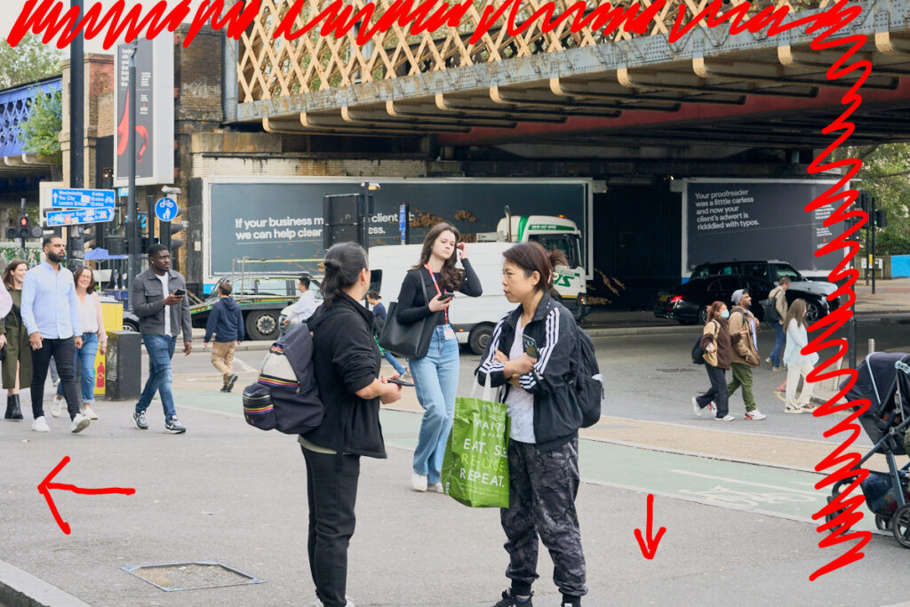
Distractions… Waterloo Station, London.
In “Distractions” I did not allow myself enough time to study the flow of humanity in front of Waterloo Station. Had I taken my time I would have composed this image towards the left and crouched down. There was not enough time to wait for the baby’s pushchair to enter the frame given the timing of the flick of hair and the visual tension in the foreground – these two elements coexisted for a moment!
That’s it – thanks for reading! As always, please feel free to hit reply and exchange your thoughts or to just say “hi”.